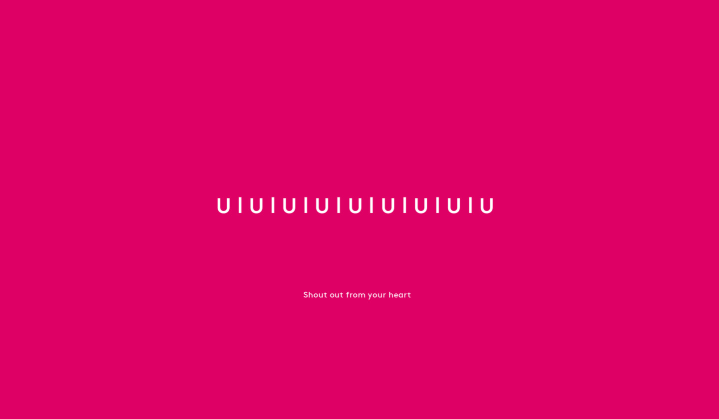
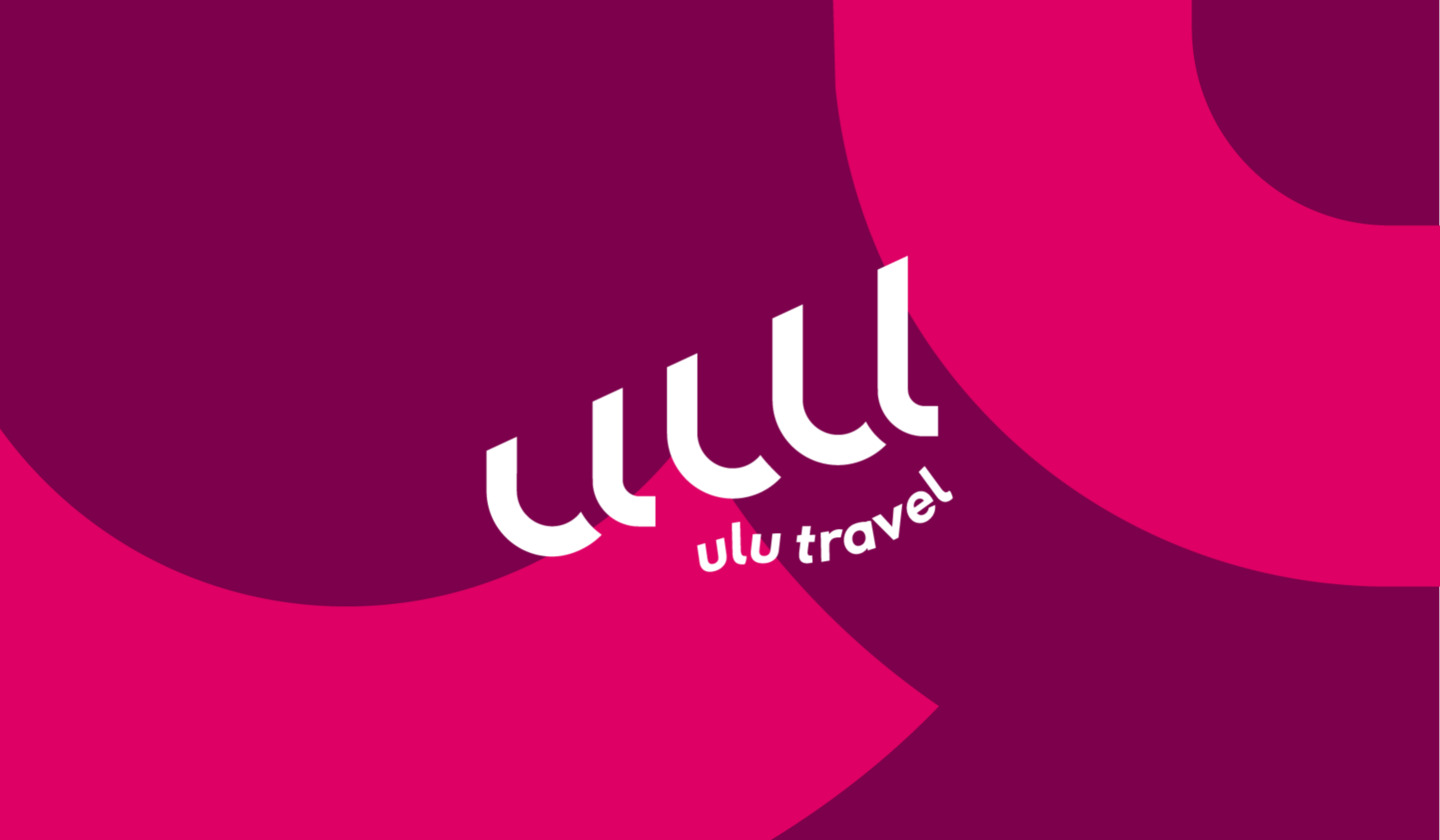
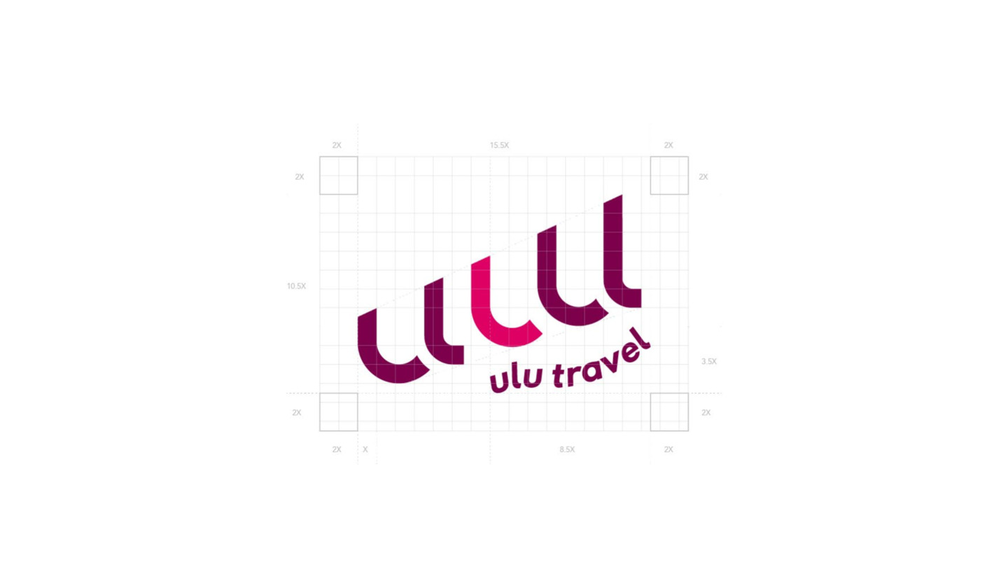
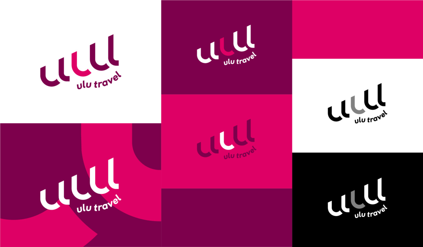
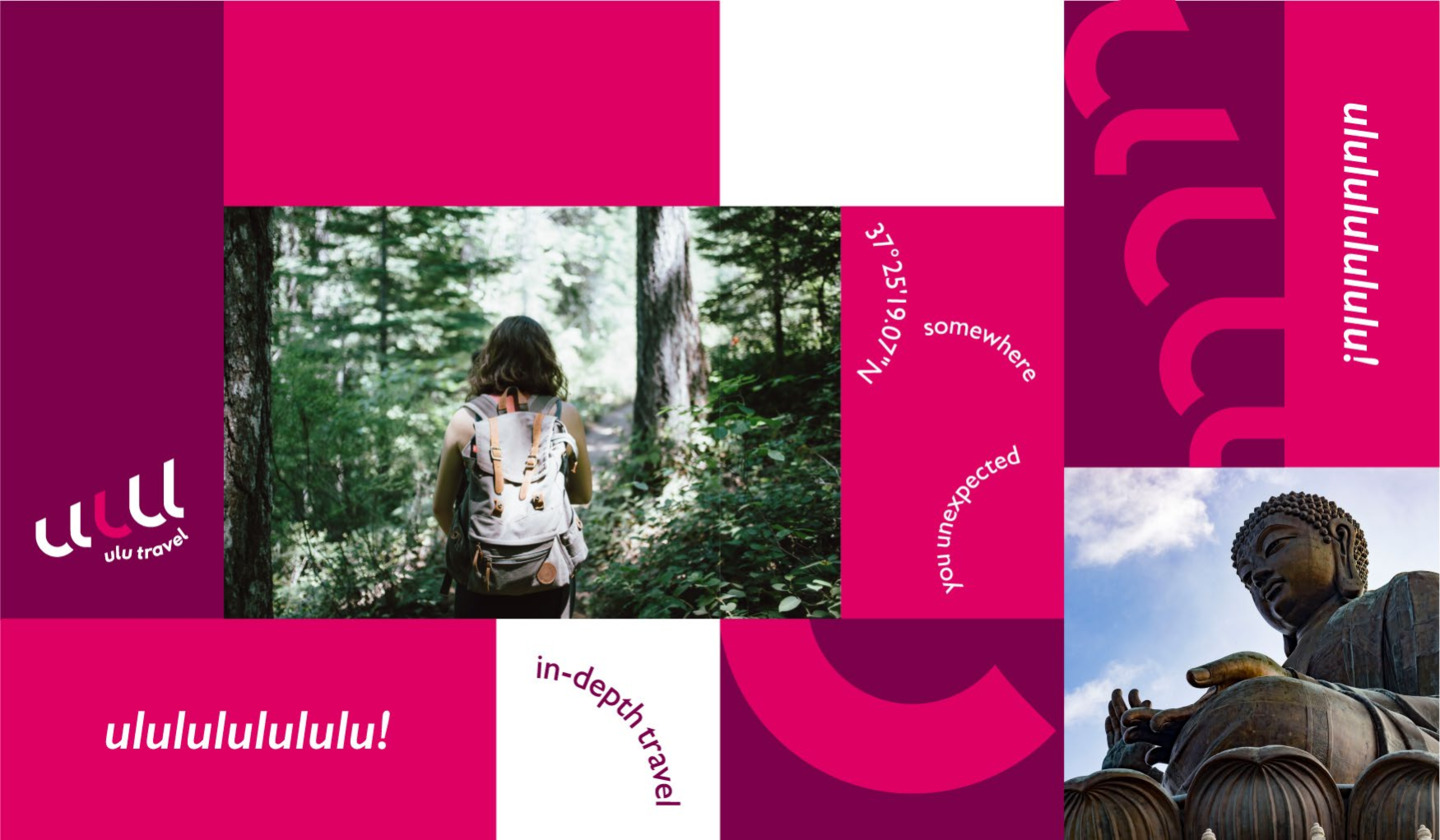
Brand identity for ulu travel. The mark uses overlapping organic circles — forms that suggest movement, exploration, and the layering of experiences — grounded in a quiet typographic system. The identity communicates the ease and openness of travel without resorting to cliché.
Scope
Brand Identity, Logo Design, Collateral